|
|
Post by rabiesisme on Dec 21, 2008 12:53:16 GMT -5
No, I mean the Ruler and Commander thing. What's up with that shit?
|
|
|
|
Post by destructin on Dec 21, 2008 12:55:44 GMT -5
No, I mean the Ruler and Commander thing. What's up with that shit? Oh, Zarth is admin for a few days, why? Blame MVG or Balto. |
|
|
|
Post by Zarth on Dec 21, 2008 13:01:09 GMT -5
No, I mean the Ruler and Commander thing. What's up with that shit? Oh, Zarth is admin for a few days, why? Blame MVG or Balto. Dont blame anyone, i was given a job to do, and i'm going to do it. Still waiting for that screen shot... |
|
|
|
Post by destructin on Dec 21, 2008 13:07:19 GMT -5
Balto, you lazy bastard, making other people do the dirty work for you.  |
|
|
|
Post by rabiesisme on Dec 21, 2008 13:08:12 GMT -5
Why are there 4 sub-boards in that one section? It seems unnecessary.
And I don't like either of the two backgrounds you posted.
|
|
|
|
Post by Zarth on Dec 21, 2008 13:12:50 GMT -5
Why are there 4 sub-boards in that one section? It seems unnecessary. And I don't like either of the two backgrounds you posted. You guys can make your own backgrounds is you want. I wasnt to get enaugh of them so i can get everyone to vote on them. The four sub borad thing. Balto and I decidid to put that up. Just to sort it out. |
|
|
|
Post by rabiesisme on Dec 21, 2008 13:21:53 GMT -5
I'm fine with this background, or the one MVG had last. The only problem I have is the black text on dark blue background, and you can easily fix that by going back to MVG's last skin.
And you might want to make the descriptions for all of the sub boards... you know, correct. No grammar or spelling errors, use caps in the start of sentences and put spaces between sentences. Seriously.
|
|
|
|
Post by Zarth on Dec 21, 2008 13:38:42 GMT -5
Alright, MVg's skin is back up, next im working on the colours of everything else.
If any one has any other scren shots could you guys post them please?
|
|
|
|
Post by rabiesisme on Dec 21, 2008 13:43:07 GMT -5
Uhm, yeah, you left the one part where it matters untouched. The part where it says "hey *username* you have *number* Pms" and that crap.
Make it the same colour as the background.
|
|
|
|
Post by Zarth on Dec 21, 2008 13:49:28 GMT -5
Uhm, yeah, you left the one part where it matters untouched. The part where it says "hey *username* you have *number* Pms" and that crap. Make it the same colour as the background. working on it. |
|
|
|
Post by rabiesisme on Dec 21, 2008 14:08:34 GMT -5
I'd make the background this colour. I refreshed the page, and this came up before the REAL background loaded. I think it's much better. Also, the bar where it says " page x of x" and all that, I would make it a slightly darker/lighter shade of the overall background colour. Right now, it's sort of a green-blueish tone, and it doesn't look good imo.  |
|
|
|
Post by Zarth on Dec 21, 2008 14:14:58 GMT -5
Ok here, circle the colour you want for that part and if you want it lighter or darker and i'll do whatever you ask for. 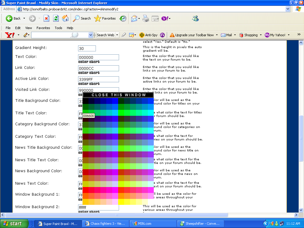 |
|
|
|
Post by rabiesisme on Dec 21, 2008 14:17:29 GMT -5
Try #01265C for the "page x of x" bar
and #002A6C for the main background. I think the horizontal stripe pattern would also make it look better.
|
|
|
|
Post by Zarth on Dec 21, 2008 14:22:22 GMT -5
Try #01265C for the "page x of x" bar and #002A6C for the main background. I think the horizontal stripe pattern would also make it look better. They need to be in hex format, other wise it wont work. |
|
|
|
Post by rabiesisme on Dec 21, 2008 14:35:45 GMT -5
I just did it.
|
|
|
|
Post by Zarth on Dec 21, 2008 14:39:39 GMT -5
Done and done. now then, for the images. Make up some images for different patrs of the forum, like the folder image beside ever board, make a new images for that, along with theverything else. When we have enaugh we will do a vote on which ones look better.
Who is editing the text colour? it's all red.
|
|
|
|
Post by rabiesisme on Dec 21, 2008 14:47:25 GMT -5
Wait.
People, what do you think about the current colour settings?
|
|
|
|
Post by destructin on Dec 21, 2008 14:48:45 GMT -5
Wait. People, what do you think about the current colour settings? I hate the red text, back to blue please. |
|
|
|
Post by Zarth on Dec 21, 2008 14:50:36 GMT -5
Wait. People, what do you think about the current colour settings? I hate the red text, back to blue please. I agree, it just doesn't look right. |
|
|
|
Post by rabiesisme on Dec 21, 2008 14:57:16 GMT -5
React.
|
|
|
|
Post by Zarth on Dec 21, 2008 15:04:19 GMT -5
Thats much better, There is still one thing missing, to change the mods and admind back to yellow and red again, I may be an admin but balto didn't give me access to the group editing tools  |
|
|
|
Post by rabiesisme on Dec 21, 2008 15:08:47 GMT -5
We'll deal with that later.
These colours good for everyone?
|
|
|
|
Post by Zarth on Dec 21, 2008 15:11:20 GMT -5
We'll deal with that later. These colours good for everyone? Maybe make the active link colour a little brighter, for the Pms, its kind of hard to see it. |
|
|
|
Post by rabiesisme on Dec 21, 2008 15:21:15 GMT -5
You mean Visited Link. I set the active link to FFFFFF (white) just to see what it is, and I still don't know, so fuck it.
Opinions about current colours please. Seriously.
|
|
|
|
Post by Zarth on Dec 21, 2008 15:22:22 GMT -5
You mean Visited Link. I set the active link to FFFFFF (white) just to see what it is, and I still don't know, so fuck it. Opinions about current colours please. Seriously. It's all perfect now. |
|
|
|
Post by Blaze on Dec 21, 2008 15:48:08 GMT -5
We'll deal with that later. These colours good for everyone? They work for me. |
|
|
|
Post by Zarth on Dec 21, 2008 19:18:14 GMT -5
Who here wants a new logo for SPB? the one we have up now is really old. I for one think that it should be changed. What about you guys? If you think the same thing then maybe start drawing up a new logo for SPB.
|
|
|
|
Post by rabiesisme on Dec 21, 2008 19:19:39 GMT -5
Who here wants a new logo for SPB? the one we have up now is really old. I for one think that it should be changed. What about you guys? If you think the same thing then maybe start drawing up a new logo for SPB. Already on it. |
|
ProDuce
Guv'na
 The Producer[M0n:-5]
Bow Before The Cloning, Nature Loving, Cell Generating Team Trio!
The Producer[M0n:-5]
Bow Before The Cloning, Nature Loving, Cell Generating Team Trio!
Posts: 1,250
|
Post by ProDuce on Dec 21, 2008 19:22:03 GMT -5
Who here wants a new logo for SPB? the one we have up now is really old. I for one think that it should be changed. What about you guys? If you think the same thing then maybe start drawing up a new logo for SPB. meh dont care. the skin i use doesnt have the logo on it so im okay with any thing  |
|
|
|
Post by danyllama on Dec 21, 2008 19:48:44 GMT -5
well, i like the colour better in destructin's screen shot because the black writing is a lot easier to see on the lighter blue.
|
|