|
|
Post by Gront on Aug 28, 2010 17:15:11 GMT -5
I like the effect of steamy eyes, but I don't really think it fits Rety. I vote second.
|
|
|
|
Post by retyuoligkl on Aug 28, 2010 18:08:33 GMT -5
Well des likes the second one too, so second it is
|
|
|
|
Post by firemario on Aug 28, 2010 23:06:24 GMT -5
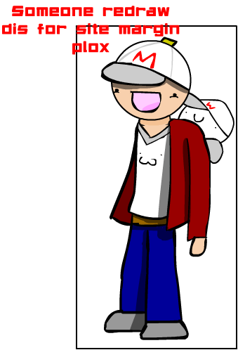
I was wondering if someone who is a much better artist than I could draw Fire Mario's banner. I've made a sketch on how I'd think he would look as a fullbodied character, but since I am a low-tier artist man, can't make it look appropriate for the sidebar. And if it would be possible, I don't want him to have a srs warface on, but more of a derp-face, because I don't really imagine him as a serious character, anyway. If no one wants to draw it, it's okay by me. Just a request. |
|
charlie
Skin Making
 [M0n:2225]
pwof [M0n:2225]
pwof
Posts: 758
|
Post by charlie on Aug 28, 2010 23:10:17 GMT -5
i would draw it and all because i am mr. not so serious but elementall's version was mind blowing man.
|
|
|
|
Post by firemario on Aug 28, 2010 23:11:23 GMT -5
i would draw it and all because i am mr. not so serious but elementall's version was mind blowing man. I know, but I think his version is just too good for the site. |
|
charlie
Skin Making
[M0n:2225]
pwof
Posts: 758
|
Post by charlie on Aug 28, 2010 23:18:34 GMT -5
i know what you mean man BUT if it's okay with you ill draw FM |
|
|
|
Post by firemario on Aug 28, 2010 23:39:44 GMT -5
Yeah, absolutely. That'd be awesome.  |
|
|
|
Post by Balto-Boy on Aug 29, 2010 1:02:22 GMT -5
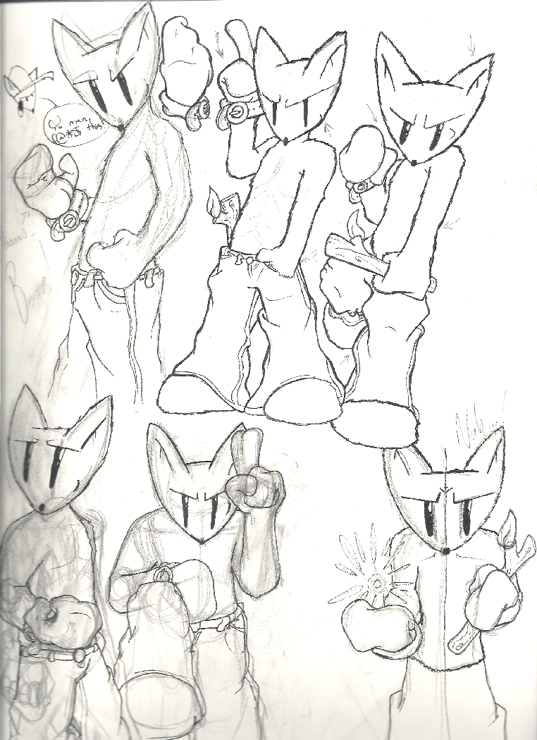
Gentlemen, I've been trying to think up an idea for Balto-Boy's pose(s), and have drawn it down to six at this point. I don't know which one to go with, so please give me your input. Also, these are just sketches and not what the actual poses would be, soooo... yeah. |
|
Candy Biu
Skin Making
Candy fiction[M0n:120]
Sweetest of them all!
Posts: 519
|
Post by Candy Biu on Aug 29, 2010 1:32:40 GMT -5
top middle
|
|
|
|
Post by destructin on Aug 29, 2010 1:39:58 GMT -5
|
|
charlie
Skin Making
[M0n:2225]
pwof
Posts: 758
|
Post by charlie on Aug 29, 2010 1:41:47 GMT -5
but why is he leaning back to much guys
|
|
Deleted
Deleted Member
Posts: 0
|
Post by Deleted on Aug 29, 2010 2:09:04 GMT -5
Bottom middle for sure.
|
|
|
|
Post by Balto-Boy on Aug 29, 2010 2:29:40 GMT -5
Well, I was afraid that that one looked a bit like a Sonic the Hedgehog pose or something... |
|
|
|
Post by rabiesisme on Aug 29, 2010 10:01:23 GMT -5
Top middle is way too gay and bottom right is kinda angsty lookin'.
I like bottom middle. It seems the most balto-like.
|
|
|
|
Post by retyuoligkl on Aug 29, 2010 11:22:09 GMT -5
i say top middle
|
|
|
|
Post by Grimscott on Aug 29, 2010 11:23:27 GMT -5
Top middle is way too gay That's like saying it's perfect. |
|
|
|
Post by rabiesisme on Aug 29, 2010 11:33:39 GMT -5
Top middle is way too gay That's like saying it's perfect. Not really. Balto, if you are going for the gayest possible "shirtless furry tough boydog that Purplecat would put in his avatar" look while keeping it SFW, you have succeeded. If you aren't going for that, I'd advise against using it. |
|
|
|
Post by Ele Mantel on Aug 29, 2010 19:54:01 GMT -5
Top right negro
|
|
Hat Salesman
Hero
 Hey hey mama, said the way you move[M0n:-6104]
Well, hello there.
Hey hey mama, said the way you move[M0n:-6104]
Well, hello there.
Posts: 3,131
|
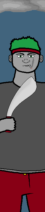
Post by Hat Salesman on Aug 30, 2010 17:11:28 GMT -5
|
|
|
|
Post by Grimscott on Aug 30, 2010 18:06:30 GMT -5
- Proportion needs A LOT of work. I see you tried to make him look big, bulky and strong, but he ended up looking fat. Fix his torso shape into something more natural to prevent this. Details such as muscles help a lot too. - Work on the hand. I know hands take forever to do right, but it's just so worth it. - More detail in general would be nice. Adding stuff like folds in clothing and. . .I can't describe it, just those lines you see on people, human bodies, it's amazing how much those can improve a picture. - It looks like you just drew a picture using only that small amount of space. Don't do that. Draw a normal pic of him (the entire body), then crop it. Don't worry about bits of him like his elbows or something getting cut out, you'll get a much more natural-looking and satisfying result anyway. - Your coloring is nice, particularly on the blade and clouds. I would suggest shading, as I think you can pull it off. Do you have trouble drawing large pictures? I'm wondering this because compared to your picture of Syko, it's nowhere near as good. If you do have trouble with it, you don't have to draw him that big. He doesn't have to take up the whole space. Give it another go. |
|
Hat Salesman
Hero
Hey hey mama, said the way you move[M0n:-6104]
Well, hello there.
Posts: 3,131
|
Post by Hat Salesman on Aug 30, 2010 18:36:19 GMT -5
- Proportion needs A LOT of work. I see you tried to make him look big, bulky and strong, but he ended up looking fat. Fix his torso shape into something more natural to prevent this. Details such as muscles help a lot too. - Work on the hand. I know hands take forever to do right, but it's just so worth it. - More detail in general would be nice. Adding stuff like folds in clothing and. . .I can't describe it, just those lines you see on people, human bodies, it's amazing how much those can improve a picture. - It looks like you just drew a picture using only that small amount of space. Don't do that. Draw a normal pic of him (the entire body), then crop it. Don't worry about bits of him like his elbows or something getting cut out, you'll get a much more natural-looking and satisfying result anyway. - Your coloring is nice, particularly on the blade and clouds. I would suggest shading, as I think you can pull it off. Do you have trouble drawing large pictures? I'm wondering this because compared to your picture of Syko, it's nowhere near as good. If you do have trouble with it, you don't have to draw him that big. He doesn't have to take up the whole space. Give it another go. I am horrible with large pictures. Like, it's ridiculous how bad I am with them. Drawing in a bigger space doesn't seem like it would help. That said, I don't want to draw small, as it wouldn't seem right considering that most of the other pictures are around the same height. |
|
|
|
Post by Grimscott on Aug 30, 2010 18:58:24 GMT -5
I am horrible with large pictures. Like, it's ridiculous how bad I am with them. Drawing in a bigger space doesn't seem like it would help. I understand. Try. And I'm not saying "draw the exact same thing in bigger space", I'm saying draw the whole (Okay, probably not the legs and stuff) body. Trust me, it'll look way better than just starting off from wherever the white space starts. That said, I don't want to draw small, as it wouldn't seem right considering that most of the other pictures are around the same height. But you made SA taller and wider than most people's sidebar Brawlers. Des draws them large, but check out the sidebar stuff for Rety*, Sandstorm, Balto and Kryten*. You don't have to draw him super small. *particularly their original sidebars, Kryten had a larger end result than the original black and white pic |
|
Hat Salesman
Hero
Hey hey mama, said the way you move[M0n:-6104]
Well, hello there.
Posts: 3,131
|
Post by Hat Salesman on Aug 30, 2010 19:02:13 GMT -5
Alright, alright, I'm already working on a newer picture. I'm shading and detailing as suggested.
Thanks for the criticism.
|
|
|
|
Post by Zarth on Aug 30, 2010 20:46:09 GMT -5
Im having problems in deciding if I want Zarth in this or not. I just cant make up my mind. nor can I will me self to draw him. :/
Hell, Im even considering on Editing my reacent concept of zarth and throwing him on here.
(oh the handicaps of being a lazy asshole....)
|
|
charlie
Skin Making
[M0n:2225]
pwof
Posts: 758
|
Post by charlie on Aug 30, 2010 21:13:27 GMT -5
zarth, everytime you draw him there's a new concept
|
|
Hat Salesman
Hero
Hey hey mama, said the way you move[M0n:-6104]
Well, hello there.
Posts: 3,131
|
Post by Hat Salesman on Aug 31, 2010 19:31:00 GMT -5
Better? I've also got a bigger version, if anyone cares to see it (PM me). |
|
|
|
Post by Gront on Aug 31, 2010 19:45:33 GMT -5
Better? I've also got a bigger version, if anyone cares to see it (PM me). Looking better, but it should be 150 px wide. Also the machete looks more like a club at this point. |
|
|
|
Post by Grimscott on Aug 31, 2010 19:53:04 GMT -5
Better? I've also got a bigger version, if anyone cares to see it (PM me). Looking better, but it should be 150 px wide. Also the machete looks more like a club at this point. This. Also you should make the muscle lines on his chest darker, they're hard to see. |
|
Hat Salesman
Hero
Hey hey mama, said the way you move[M0n:-6104]
Well, hello there.
Posts: 3,131
|
Post by Hat Salesman on Aug 31, 2010 20:01:16 GMT -5
oh you guys I was actually going more for a kukri look than a machete. |
|
|
|
Post by DJGrandPa on Sept 7, 2010 1:56:43 GMT -5
I gotta admit, at first look I thought he was jerking off... it's a nice drawing though.
|
|